Task:Improving the Application manager
As one of the foremost application's in a new user's experience of Maemo, Application manager needs to be one of the platform's best (perhaps only superceded by the browser and email client). As it stands, though, it is still in need of improvement in a lot of areas.
Contents |
Category view
I was having a discussion with X-Fade today on the repository category mess, and the possibility of having usable categories besides "All" (sadly, I haven't even looked at anything but "All" since at least OS2005 :\) made me consider some of the issues with the current category setup in Application manager.
Grid view
The current category view has an awful lot of wasted whitespace. My initial reaction here was that a grid view in place of a the current list-view would make better use of space and improve the thumb-ability (ordering is badly messed-up in my mock-up—it should be left-to-right rather than top-to-bottom). The number of packages in each category should be noted parenthetically next to the category name (shown in the tree-view mock-up).
This view does have a few downfalls, though. It doesn't make it easy to see what's in any particular category, so if you're searching for something or just browsing around, you will be jumping between the category view and application list view quite a bit. Which is expensive in taps and rendering. Also, longer category names may cause rendering issues (Communications becoming Communicat... is just plain bad).
Tree view
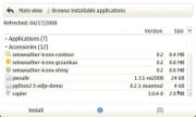
The grid-view is probably the most straightforward and immediate solution, but some extra options wouldn't hurt. Some sort of tree view (while mildly ungainly with such limited screen real estate) could give a nice overview alternative to "All" while reducing the number of screens the user needs to scroll through. Show all the categories as collapsible branches, and indicate the number of packages in each category parenthetically next to the category name. The user can collapse or expand a branch by tapping on the category name, or using the dpad up/down to scroll to the desired category and the left/right to collapse or expand it.
Column view
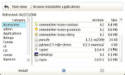
Finally a column view could be another useful alternative for reducing the number of screens to tap through and provide a better overview. Put a column of categories on the left (again, with the number of packages in each category indicated parenthetically) and display the packages in that category in the right column. Basically, the same behavior as the File manager.
Each of these views has their own advantages and disadvantages, as such, a single view shouldn't be picked at the exclusion of all others, rather, all views could be implemented and a switch (either in the menu, or on the button bar, and perhaps as shortcuts for N810 users) added to toggle between them depending on user-preference on use-case.
Application list
The application list is where most of the user's time will be spent—browsing and installing
Info dialog
Most of what the information dialog suffers from is a bad case of the scrollies. Almost all of the time every tab of this dialog has a horizontal scrollbar. This should really never happen for a native widget, especially since pratically all of the information being displayed could be intelligently soft-wrapped.
Summary
Description
Installing/Uninstalling/Upgrading
This tab is a particularly bad offender, as the content is pretty much a known value.


