Task:Improving the Application manager
As one of the foremost applications in a new user's experience of Maemo, Application manager needs to be one of the platform's best (perhaps only surpassed by the browser and email client). As it stands, though, it is still in need of improvement in a lot of areas. Some of these improvements are small changes (like allowing the repository list to be refreshed from the main view), and some of them are quite large (like the category view overhaul), but the end result should be a much better and more usable Application manager.
Contents |
[edit] Goals for Fremantle
Until we get more specifics on the new UI for Fremantle, let's set out some general features we'd like to see implemented.
[edit] Tracker and debtags
Tracker being included in Fremantle offers some interesting opportunities to use metadata. debtags were proposed as a potential solution to the package categories issue, but they likely offer more potential by providing metadata to be indexed for searching with Tracker. Say I'm looking to find a web browser. Normally, I'd either know the list of available browsers for Maemo, know which one I wanted and go straight for it, or I'd tap on the "Internet & Network" and find them there. Unfortunately, things like Boingo, email clients, ftp clients and ssh are also going to be in that list, and picking names like "MicroB", "Fennec" or "Tear" out as web browsers without looking at the descriptions is impossible. With Tracker (and usefully complete and accurate tagging), I can simply type "web browser" into a search field to pull up a list of browsers.
[edit] Integrations with Downloads
Downloads offers a great place to get more detailed information about packages (including detailed descriptions, change logs, and screenshots), and to comment and provide feedback. Users should be able to enter their maemo.org credentials into the Application Manager, then comment on and rate packages directly from the it. This will both increase the amount of feedback received by packages in Downloads and increase the amount of data available to users browsing for packages.
Data from Downloads should be used to provide "Fresh", "Popular", and "Highest rated" lists on the main view.
[edit] Revised application info panel
The package info dialog is too limited in the current Application Manager, a fullscreen view should be added that includes several tabs containing a description, screenshots, comments and ratings, as well as maintainer, section, repository, version, size, and dependency information.
[edit] Find as you type
Most modern operating systems support find as you type. When presented with a list of items, a user can begin typing the name of the item they want and it will jump right to it. This wasn't feasible in Maemo before the N810's hardware keyboard, but with the hardware keyboard it's something that many users expect.
[edit] Main view
The main view is a user's portal to Maemo software, it's largely fine right now, but not very interesting. It needs a way to draw in new users and get them interested in the software available to them.
[edit] New buttons
One way to make the view more interesting is to add a few buttons over on the right hand side (where the big Application manager icon is right now). Something like, Featured applications (taken from Downloads), Popular applications (also from Downloads), and New applications (since last repository refresh, or maybe new in the last week—the specifics of this one will need consideration). As most of the Featured and Popular applications will reside in Extras (and Extras ships disabled), this would serve as a nice way to introduce new users to Extras by offering to enable it for them when they go to install an application from these lists.
- Bug #3279 - Streamlining user access to the Extras repository
[edit] Button bar
The button bar is another small problem with the main view. Right now, all the icons are grayed out and useless. At the very least, the repository refresh button should be enabled here. The search button could be enabled to perform a global search (with filters for available/installed applications), the install button could be replaced with the repository list, and the info button could show the logs.
[edit] Category view
The category view is really the worst part of Application manager right now. It's so bad, in fact, that there really isn't much point in browsing under anything but "All". This is a combination of two issues, the poor state of Maemo packaging consistency, and a straight-up badly put together category view. The packaging issue is separate from Application manager, and will hopefully be addressed somewhat by the new packaging guidelines.
[edit] Grid view
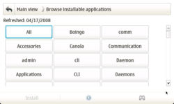
The current category view has an awful lot of wasted whitespace. My initial reaction here was that a grid view in place of a the current list-view would make better use of space and improve the thumb-ability (ordering is badly messed-up in my mock-up—it should be left-to-right rather than top-to-bottom). The number of packages in each category should be noted parenthetically next to the category name (shown in the tree-view mock-up).
This view does have a few downfalls, though. It doesn't make it easy to see what's in any particular category, so if you're searching for something or just browsing around, you will be jumping between the category view and application list view quite a bit. Which is expensive in taps and rendering. Also, longer category names may cause rendering issues (Communications becoming Communicat... is just plain bad).
[edit] Tree view
The grid-view is probably the most straightforward and immediate solution, but some extra options wouldn't hurt. Some sort of tree view (while mildly ungainly with such limited screen real estate) could give a nice overview alternative to "All" while reducing the number of screens the user needs to scroll through. Show all the categories as collapsible branches, and indicate the number of packages in each category parenthetically next to the category name. The user can collapse or expand a branch by tapping on the category name, or using the dpad up/down to scroll to the desired category and the left/right to collapse or expand it.
[edit] Column view
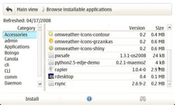
Finally a column view could be another useful alternative for reducing the number of screens to tap through and provide a better overview. Put a column of categories on the left (again, with the number of packages in each category indicated parenthetically) and display the packages in that category in the right column. Basically, the same behavior as the File manager.
Each of these views has their own advantages and disadvantages, as such, a single view shouldn't be picked at the exclusion of all others, rather, all views could be implemented and a switch (either in the menu, or on the button bar, and perhaps as shortcuts for N810 users) added to toggle between them depending on user-preference on use-case.
[edit] Application list
The application list is where most of the user's time will be spent—browsing and installing/removing/updating applications and packages—and is arguably the most important area of the Application manager. As it stands, most of what's wrong with the application list is either technical (e.g., the irritating list refresh) or related to the various dialogs related to the list (e.g., the info dialog), and the basic UI of the application list is really quite fine.
- Change to Modest's nice, big, thumbable scroll bars. Another option would be to do away with scroll bars and have kinetic thumb-scrolling.
- Columns should be sortable by tapping their names, as well as from the menu. It should also be possible to resize them.
- List refresh needs to be somehow sped up on completely eliminated. This is much better in Diablo, as it doesn't refresh whenever you look at it funny, but still a problem.
- Destroying and redrawing the list is annoying, even if it does now remember your current location. I'd prefer individual rows to be removed (need to see how slow this would be).
- Pressing a key (N810) should jump the list to the first item named with that letter (e.g. press "v" jumps/scrolls the list to the first package called "v.....")
- We should look at the possibility of allow multiple install/removes. I.e. we could create a "Mark for Installation" button on the highlighted row, then use the "Install" button in the toolbar as "Install Marked Packages". Likewise for removing packages. This would save quite a lot of time for people who want to install/remove more than one thing.
- If there are problems with the installation (e.g. unmet dependencies), visually indicate it instead of letting the user attempt only to be told he can't two dialogs later. Have a validate button if this will take time to figure out.
- If the package is not going to be backed up (e.g. non-user in red-pill), or might involve other differences from how a normal user package is installed and metadata stored, indicate that on this screen or the install ok/cancel dialog.
- (Install/Upgrade) Have a way of downloading the debs to the memory card and don't delete them when cleaning (for restore purposes, e.g. reflash to avoid downloading everything again).
- (Install/Upgrade) For batch upgrades or installs, have a "continue on any error" option instead of having to say continue on every package. Perhaps have something to indicate it will prompt and install all non-prompting first.
[edit] Info dialog
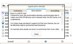
What the information dialog suffers from is a bad case of the scrollies. Practically every tab for almost every package presents the user with a horizontal scroll bar. This should really never happen for a native widget.
Or of both of these things will reduce the occurrence of the horizontal scroll bar:
- The horizontal width of the info dialog should be expanded slightly to contain more information (there is a lot of additional room available in fullscreen).
- The information being displayed should be intelligently soft-wrapped and/or slightly reformatted to fit into the dialog.
[edit] Summary
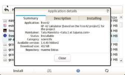
The summary tab is mostly OK. Adding a "Repository" item to indicate which repository a package is in would be useful (especially for identifying Extras and Extras-devel packages). The largest problem is the short description that doesn't get soft-wrapped. Soft-wrapping this description would eliminate the horizontal scrolling in most cases for the summary tab.
[edit] Description
The description field also needs soft-wrapping to make some descriptions fit. The problem here is that many descriptions are already hard-wrapped, which might result in ugly half-soft/half-hard–wrapped text. Some simple de-wrapping (e.g. just removing all newlines that aren't followed by a blank line) may already result in a pleasing line wrap. This may need to be addressed packaging-side.
[edit] Installing/Uninstalling/Upgrading/Problems
This tab is a particularly bad offender, as the content is a known value—we know the type of information that appears here and we can predict how it will be formatted. The first and simplest solution is to take all of the packages under each heading and aligned them with the left side of the dialog. Most of the problems crop up from having such a huge amount of whitespace to the left of the package lists, so bringing these lists down a line and over to the left would eliminate a lot of horizontal scrolling. The headings (e.g., "Application packages missing:") will need to be offset from the text somehow, too.
- This page was last modified on 13 May 2011, at 21:38.
- This page has been accessed 95,934 times.


