Talk:Maemo.org logo contest submissions
(→sifaldkz: new section) |
(→uouqufyh: new section) |
||
| Line 214: | Line 214: | ||
<a href="https://buylevitra.shop/">generic levitra 40mg</a> | <a href="https://buylevitra.shop/">generic levitra 40mg</a> | ||
| + | |||
| + | == uouqufyh == | ||
| + | |||
| + | <a href="https://ivermectin.properties/">ivermectin generic</a> | ||
Revision as of 08:49, 28 May 2022
Contents |
Proposals with "Maemo"
Even if it's clear in the instructions that the logo needs to have the text "maemo.org" and only that, there are many proposals on "Maemo". What should we do with them? Take them out of the submissions page? It would be counterproductive that other designers see the proposals and think that despite the rule it is ok to send more "Maemo" proposals.--qgil 20:30, 19 June 2008 (UTC)
- X-Fade and I were discussing this on #maemo earlier. We could:
- Drop the non-compliant submissions onto a separate page.
- Mark them as non-compliant with a template with lots of red borders and text.
- Remove them outright and notify the submitter that the submission is non-compliant.
- Not sure what the best solution is, but we do need to do something about it soon. —GeneralAntilles 20:42, 19 June 2008 (UTC)
- What about putting a disclaimer on the top i.e. Submissions not following the contest rules will be removed from this page and removing them? The logos themselves are still uploaded and etc, so no big harm. A "Maemo" logo will not win the contest in any way, so it's not like the author is losing something in practical terms. They better know asap that their entry hasn't been accepted.--qgil 03:09, 20 June 2008 (UTC)
Proposals with Tux penguin
Even if the Tux penguin is an image with a permissive license, I think we should discard those entries using it. The license still claims some kind of (very licit!) aknowledgement to the creator. The meaning is centered in the Linux Kernel. Right, Maemo uses this kernel and the maemo.org community has some kernel hackers. But that's it, a selected logo with Tux inside would be totally misleading. --qgil 19:34, 22 June 2008 (UTC)
Proposals with gradients or textures
There's a number of proposals currently using gradients or colors. This seems non-compliant, and justification for removal to the talk page. However, it's complicated slightly because some deliberately use subtle gradients as a (stated) optional part of the design, which can be reduced to flat colors with no problem. I'm not sure if such dual-mode logos are permitted, and I didn't want to start dragging all the straightforward cases (where the gradient/texture was an essential design element) without being able to finish.
The gradient-optional images are somewhat similar to the favicon configurations popping up; while the use of the logo in a favicon size is mentioned in the rules, submitting it as a favicon is not; while no mention of a gradient-friendly form is mentioned in the rules, it shares the relationship as an alternate version of the design.
One solution that presents itself is to remove all images containing gradients, and all favicons, as primary submissions, and establish a template for one submission with a primary image (~500px as per rules), and a (any?) number of alternate versions as one design. Favicons and other rearrangements of the same design for different medium constraints would be alternate versions, but different color schemes, faces, etc. would be separate submissions.
The main problem with that is that the rules for submission process, while not flagged as "discussion closed", are not "open for discussion" either; I'm not at all sure this level of change is acceptable at this point.
Any ideas? benson 03:57, 27 June 2008 (UTC)
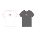
- Good point. I was looking at the explosion of t-shirts and I alos was thinking that, while it's a nice idea, it adds even more noise to the main page. At the end the invalid logos are not deleted and people need to be finding out that whenever something disappears from the main page is here in the discussion page. Tim has selected some entries and then has moved the rest here, making links in both sides. The same could be done on shirts and favicons, moved all of them here. It is good that an authhor says "I'm working in this concept, here is the main logo and then some applications are available in th discussion page".
- The same could be done about the gradient variants. I'm not sure either about the submissions with gradients only. What about doing a first cleaning of shirts etc and then look at the page to see how to continue?--qgil 06:28, 27 June 2008 (UTC)
- Making an 8-letter word into a 16- or 32-pixel-wide icon is going to require some ingenuity. Even Google worked out dozens (hundreds?) of favicons before choosing one that's a single "g". So I think the designer's notions of alternate forms ought to be kept with the submission. rsperberg 21:52, 30 June 2008 (UTC)
- I agree with this. Shrinking 500 pixels of content into 16 pixels is no easy matter, with or without gradients. Is it to be left up to moderators to provide a favicon for the winning submission, or should the contestants? I'd think the favicon should be part of the contest, however, many people didn't contribute one, because it wasn't really specified in the guidelines. Maybe another page (or section on the submissions page) should be made to hold all favicon "suggestions." T-shirts and other examples, should be removed though. They don't contribute to the contest, they just take up space.--underscore 16:16, 3 July 2008 (UTC)
Submissions discarded
Because of having "Maemo" instead of "maemo.org", having potential trademark issues or using existing logos (i.e. Tux penguin).
samantha
Very nice logo, but looks a little too much like the Summer Olympic '92 logo.
dzahariev
fredyrivera
jobelium
asgari
GarethLWalt
- Discounted #1b as it's too similar to Palm, Inc's logo IMHO --Jaffa 00:08, 21 June 2008 (UTC)
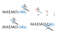
- I would suggest a review of this image as well - if my logo was too similar to the old Palm logo --garethlwalt 14:47, 25 June 2008 (UTC)
- You know what? You're right... Didn't even think about it. I'll move it to below. --timsamoff 12:11, 26 June 2008 (UTC)
jussi
Breaking the rules
Legacy versions
Alternative version, solid moebius strip. Updated with some feedback from User:thiercito. |
|||
- To be perfectly honest, personally I prefer these versions (and the original orange dotted ae moebius ligature) than the newer versions with the moebius separate. --12:02, 16 July 2008 (UTC)'
- Hmm, yeah, perhaps I can make a third version. Anyway, all these logos are more idea based. If the community wants to work more with me in this, they should be tweaked a lot before they're actually done. --jussi 15:27, 16 July 2008 (UTC)
thiercito
timsamoff
Tim has volunteered to judge the comnest, and as such we removed his 2 entries from the mix. They are saved here for reference.
Note: I've honed my submissions down to my favorite ideas. For the rest, please view the Discussion page. --timsamoff 14:38, 26 June 2008 (UTC)
- Really appreciated. Pruning is a well known method to get better flowers and fruits.--qgil 15:41, 26 June 2008 (UTC)
Additional Design ideas:
Discarded -- as discussed above. --timsamoff 12:18, 26 June 2008 (UTC)
femorandeira
deadknight88
chall3ng3r
rambutan
iuirzlcq
<a href="https://ivermectin.republican/">ivermectin prescription</a>
ekwxdwuv
<a href="https://buymetformin.shop/">metformin 5 mg</a>
ighwtwvq
<a href="https://buydoxycycline.shop/">azithromycin doxycycline</a>
sifaldkz
<a href="https://buylevitra.shop/">generic levitra 40mg</a>
uouqufyh
<a href="https://ivermectin.properties/">ivermectin generic</a>


