Legacy Maemo 5 Documentation/Desktop Widget UI Guidelines
(→Margins and positioning) |
(wikify slightly) |
||
| (24 intermediate revisions not shown) | |||
| Line 1: | Line 1: | ||
| - | + | {{legacy documentation}} | |
| - | The Desktop Widget Guidelines‐document is intended as an aid for developers to build Desktop Widgets according to the design philosophy, interaction model, and visual look‐and‐feel of Maemo 5. | + | |
| + | The Desktop Widget Guidelines‐document is intended as an aid for developers to [[Documentation/Maemo 5 Developer Guide/Application Development/Writing Desktop Widgets|build Desktop Widgets]] according to the design philosophy, interaction model, and visual look‐and‐feel of Maemo 5. | ||
By following these guidelines, developers are assured to build Widgets that are consistent, and accessible for end‐users. | By following these guidelines, developers are assured to build Widgets that are consistent, and accessible for end‐users. | ||
| - | + | This document is supported by the [http://www.forum.nokia.com/info/sw.nokia.com/id/e778ba1f-2507-4672-be45-798359a3aea7/Fremantle_Master_Layout_Guide.html Fremantle Master Layout Guide] and [http://www.forum.nokia.com/info/sw.nokia.com/id/eb8a68ba-6225-4d84-ba8f-a00e4a05ff6f/Hildon_2_2_UI_Style_Guide.html Hildon 2.2 UI Style Guide] for visual guidance and references, as well as by the [http://www.forum.nokia.com/info/sw.nokia.com/id/019c2b31-3777-49a0-9257-970d79580756/Hildon_2_2_Widget_UI_Specification.html Hildon 2.2 Widget UI Specification] for interaction and technical background information. | |
| - | + | ||
| - | + | ||
| - | + | == Introduction == | |
| - | + | ||
| - | + | Desktop Widgets can be defined as miniature applications – or applets – that reside on the Desktop for convenient, fast access to useful information or controls. Maemo 5 contains up to '''four''' Desktops, as illustrated in Figure 1, totaling in 3200×424 pixels of screen real‐estate for Desktop Widgets. | |
| - | + | [[Image:desktop-views.png|thumb|center|600px|alt=Screenshot of desktop views|Figure 1: Maemo 5 includes up to four Desktops for Widgets]] | |
| - | = | + | {{ambox|text=In Maemo terminology, in addition to Widgets, Maemo 5 also includes ''Application shortcuts'', ''Web bookmarks'', and ''Contacts''. Technically, however, these are considered Desktop Widgets as well, and the same guidelines apply. Thus, for the sake of readability, the term “Widget” used in this document encompasses '''all''' the aforementioned applets.}} |
| - | == | + | == Widget design == |
| - | + | ||
| - | + | === Design philosophy === | |
| - | + | ||
| - | + | ||
| - | + | While Widgets can be understood as small applications, the design philosophy for developing a Widget differs greatly from that of an application. Most notably, Widgets are '''not supposed to replace applications''' in terms of their use and feature set, '''rather compliment them'''; consider the following guidelines as the fundamental design goals of building an appropriate Widget: | |
| - | + | * Widgets must provide information or controls '''quickly''' and in an '''obvious manner'''; every feature and command should be '''immediately understandable''', and '''accessible with a single tap'''. | |
| - | + | * Widgets must provide only the '''most crucial features'''; they must be '''simple and efficient''', designed to accomplish only a few tasks – but accomplish those extremely well. | |
| - | Maemo 5 | + | * Widgets must be as '''compact in size''' as possible; even though Maemo 5 offers a generous amount of screen space, users must be able to place several widgets on each screen to minimize the need for excessive screen switching. |
| - | {| | + | {{ambox|text=Due to the high pixel density of the physical screen, tappable elements must be at least 70×70 pixels in size for convenient finger use.}} |
| - | + | ||
| - | + | ||
| - | + | ||
| + | Due to the aforementioned design goals, not every application can be transformed into, or any data set presented with a legitimate Widget. Before starting development, consider whether the Widget provides any value for end‐users in comparison to existing applications or websites that can be one tap away via ''Application shortcuts'' or ''Web bookmarks''. | ||
| + | |||
| + | === Stock Widgets === | ||
| + | |||
| + | Maemo 5 includes following Widgets, outlined in Table 1. | ||
| + | |||
| + | {| class="wikitable" | ||
| + | |+ Table 1. Overview of stock Widgets included in Maemo 5. | ||
| + | ! Widget name | ||
| + | ! Description | ||
| + | ! Dimensions (in pixels) | ||
|- | |- | ||
|Application shortcut | |Application shortcut | ||
|Provides one‐touch access to an application | |Provides one‐touch access to an application | ||
| - | | | + | |96×96 |
| - | + | ||
|- | |- | ||
|Calendar widget | |Calendar widget | ||
|Displays the current date and upcoming calendar events | |Displays the current date and upcoming calendar events | ||
| - | | | + | |352×252 |
| - | + | |- | |
| + | |Google widget | ||
| + | |Provides one-touch access to Google search | ||
| + | |176×146 | ||
|- | |- | ||
|Location widget | |Location widget | ||
|Displays the current location of the user on a map | |Displays the current location of the user on a map | ||
| - | | | + | |316×368 |
| - | + | ||
|- | |- | ||
|Media Player widget | |Media Player widget | ||
|Provides Media Player status and controls. | |Provides Media Player status and controls. | ||
| - | | | + | |338×148 |
| - | + | ||
|- | |- | ||
|Ovi widget | |Ovi widget | ||
|Provides access to Ovi services | |Provides access to Ovi services | ||
| - | | | + | |490×88 |
| - | + | ||
|- | |- | ||
|RSS widget | |RSS widget | ||
|Displays the latest RSS feeds | |Displays the latest RSS feeds | ||
| - | | | + | |316×368 |
| - | + | ||
|- | |- | ||
|Tutorial widget | |Tutorial widget | ||
|Presents a tutorial on how to use the device | |Presents a tutorial on how to use the device | ||
| - | | | + | |800×72 |
| - | + | ||
|- | |- | ||
|Web bookmark | |Web bookmark | ||
|Provides one‐touch access to a web bookmark | |Provides one‐touch access to a web bookmark | ||
| - | | | + | |176×146 |
| - | + | ||
|} | |} | ||
| - | + | === Configuration options === | |
| - | |||
| - | |||
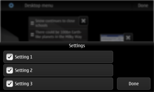
Widgets that can be configured include a configuration‐button accessible in ''Edit mode''. Tapping on the button reveals a dialog containing all the available configuration options. Figure 2 presents a fictional example of a configuration dialog. | Widgets that can be configured include a configuration‐button accessible in ''Edit mode''. Tapping on the button reveals a dialog containing all the available configuration options. Figure 2 presents a fictional example of a configuration dialog. | ||
| - | [[Image:configuration_dialog.png| | + | [[Image:configuration_dialog.png|thumb|center|300px|alt=Screenshot of configuration dialog|Figure 2: Example configuration dialog for a Widget]] |
| - | + | ||
| - | + | == Interaction == | |
| - | + | Within the Desktop, Widgets are interacted with by '''taps only''' (events should be initiated when the finger is released, not pressed down). Due to the prioritization of screen switching, Widgets '''do not support dragging or swiping gestures'''; this ensures that Desktop screens can be effortlessly panned even if they are filled with Widgets. Furthermore, '''long-tapping''' (tapping and holding the finger on the screen for an extended period of time) cannot be used for Widget interaction, since it activates the Edit mode by default. | |
| - | Within the Desktop, Widgets are interacted with by '''taps only'''. Due to the prioritization of screen switching, Widgets '''do not support dragging or swiping gestures'''; this ensures that Desktop screens can be effortlessly panned even if they are filled with Widgets. | + | |
| - | + | N.B. Dragging gestures are naturally enabled in the ''Edit mode'' for repositioning Widgets, where screen switching is not supported. | |
| - | In Maemo 5, Widgets '''do not support resizing'''. It is advised to not develop Widgets that dynamically change their size, because their visibility cannot be ensured; since Widgets can be placed near the edges of the screen, or near each other, any appearing elements | + | In Maemo 5, Widgets '''do not support resizing'''. It is advised to not develop Widgets that dynamically change their size, because their visibility cannot be ensured; since Widgets can be placed near the edges of the screen, or near each other, any appearing elements can become occluded or entirely overlapped by other Widgets, or hidden outside the bounds of the screen. |
| - | All tappable elements on Widgets | + | All tappable elements on Widgets must contain a graphical highlight (pressed‐down) state for providing visual feedback on the action. If the entire Widget is a tappable element, such as with ''Web bookmarks'', the highlight state also encompasses the whole Widget. Examples of highlight states are shown in Figure 3. |
| - | [[Image:highlight_states.png| | + | [[Image:highlight_states.png|thumb|center|300px|alt=Screenshot showing example widget states|Figure 3: Examples of highlight states of various widgets]] |
| - | + | ||
| - | + | While text entries and areas (also known as text input fields) are supported UI widgets, they should be used with care; if several text entries are needed, they can also be provided either via a custom dialog, or utilizing the Widget’s configuration dialog. | |
| - | = Visual look-and-feel = | + | == Visual look-and-feel == |
| - | == Size == | + | === Size === |
| - | + | ||
| - | + | Widgets must be designed to be as compact in their size as possible, avoiding any excessive graphical elements that do not provide any meaningful information or controls. As a rule of thumb, the footprint of a Widget '''must never exceed half of the Desktop space''' allocated for Widgets, including a 24 pixel‐padding around the Widget (132,352 pixels total). The largest stock Widgets, ''Location'' and ''RSS'', are close to the maximum footprint of Widgets, as seen in Figure 4; another, ''Tutorial'', spans across the entire Desktop, but therefore remains limited in its height. | |
| - | + | ||
| - | + | [[Image:location_widget.png|thumb|center|300px|alt=Screenshot of lactin widget|Figure 4: The Location Widget is close to the maximum size of Widgets]] | |
| - | == Margins and positioning == | + | === Margins and positioning === |
| - | + | ||
| - | + | Layouts in Maemo 5 utilize a standardized set of margins. The recommended margins for Widgets are outlined in Table 2. | |
| - | + | ||
| - | + | ||
| - | + | ||
| + | {| class="wikitable" | ||
| + | |+ Table 2. Standard margins for Widgets. | ||
| + | ! Logical name | ||
| + | ! Size (pixels) | ||
| + | ! Additional information | ||
|- | |- | ||
| - | |<font color="red">HILDON_MARGIN_HALF</font> | + | |<font color="red"><code>HILDON_MARGIN_HALF</code></font> |
| - | |<font color="red">4 | + | |<font color="red">4</font> |
|<font color="red">Marked as red bar in layout images</font> | |<font color="red">Marked as red bar in layout images</font> | ||
| - | |||
|- | |- | ||
| - | |<font color="blue">HILDON_MARGIN_DEFAULT</font> | + | |<font color="blue"><code>HILDON_MARGIN_DEFAULT</code></font> |
| - | |<font color="blue">8 | + | |<font color="blue">8</font> |
|<font color="blue">Marked as blue bar in layout images</font> | |<font color="blue">Marked as blue bar in layout images</font> | ||
| - | |||
|- | |- | ||
| - | |<font color="cyan">HILDON_MARGIN_DOUBLE</font> | + | |<font color="cyan"><code>HILDON_MARGIN_DOUBLE</code></font> |
| - | |<font color="cyan">16 | + | |<font color="cyan">16</font> |
|<font color="cyan">Marked as cyan bar in layout images</font> | |<font color="cyan">Marked as cyan bar in layout images</font> | ||
| - | |||
|} | |} | ||
| - | < | + | Stock widgets share common margins and positioning rules. Elements within Widgets are separated from each other by <code>HILDON_MARGIN_HALF</code>, and Widgets are surrounded by <code>HILDON_MARGIN_DEFAULT</code>; the surrounding area includes both the outer border of the Widget, as well as a drop shadow. Some examples are presented in Figure 5, and Figure 6. |
| - | + | [[Image:applet-wireframes+specs.png|thumb|center|800px|alt=Illustration of widget margins|Figure 5. Examples of margin use in stock Widgets]] | |
| - | [[Image: | + | [[Image:widgets+wireframes.png|thumb|center|800px|alt=Illustration of widget construction|Figure 6. Examples of visual Widget construction]] |
| - | + | ||
| - | + | The positioning of graphical elements such as text labels, buttons, icons and so on must be in line with the rest of the Maemo 5 guidelines. | |
| - | + | ||
| - | + | === Visuals === | |
| - | |||
| - | |||
| - | |||
In Maemo 5, the overall graphical look‐and‐feel is designed as light‐colored text and icons on dark backgrounds. All of the default Widgets follow this principle; graphic themes also contain a so‐called ''reversed color palette'', which enable the use of dark text on light backgrounds. | In Maemo 5, the overall graphical look‐and‐feel is designed as light‐colored text and icons on dark backgrounds. All of the default Widgets follow this principle; graphic themes also contain a so‐called ''reversed color palette'', which enable the use of dark text on light backgrounds. | ||
| - | + | === Typography === | |
| - | == Typography == | + | |
| - | Due to their compact size, default Widgets generally use | + | Due to their compact size, default Widgets generally use <code>HomeSystemFont</code> or <code>SmallSystemFont</code> as the font size, while <code>DefaultTextColor</code> is used as the default text color. There is also a standard Sans-Serif font available for use. |
| + | |||
| + | Text labels in Widgets should be separated with at least <code>HILDON_MARGIN_HALF</code> from the edges of their respective container elements to make sure that long labels do not end up touching element borders; see Figure 5 for visualizations. | ||
| + | |||
| + | Figure 7 presents an example of the use of typography in Widgets. | ||
| + | |||
| + | [[Image:widget_typography.png|thumb|center|300px|alt=Screenshot of widget typography|Figure 7: An example of the use of typography in Widgets]] | ||
| + | |||
| + | == Development == | ||
| + | |||
| + | === Packaging === | ||
| + | |||
| + | {{main|Packaging}} | ||
| + | |||
| + | Widgets are installed on the device using a normal Debian application package. As the package information of your desktop widget can be seen in Application manager (the application used to install Widgets), it is recommended to fill in the following information in the package: | ||
| - | + | * Application name – a descriptive name shown in the application package list view in Application manager | |
| + | * Application short description – the first line (or 60 first characters) of the application description | ||
| + | * Application icon – a base64 encoded PNG image (sized 48×48 pixels). This icon is only shown in Application manager | ||
| - | + | Unless the installation script of the Widget package contains commands to place the Widget on the Desktop, users have to manually do so via Edit mode. Since this is an unnecessary step for the user, it is advised that the installation script handles the placement automatically. It is also possible to direct the Widget onto a specific Desktop view; however, the exact placement of the Widget cannot be specified in the script. | |
| - | + | == References == | |
| - | + | * [http://www.forum.nokia.com/info/sw.nokia.com/id/eb8a68ba-6225-4d84-ba8f-a00e4a05ff6f/Hildon_2_2_UI_Style_Guide.html Hildon 2.2 UI Style Guide] | |
| + | * [http://www.forum.nokia.com/info/sw.nokia.com/id/e778ba1f-2507-4672-be45-798359a3aea7/Fremantle_Master_Layout_Guide.html Fremantle Master Layout Guide] | ||
| + | * [http://www.forum.nokia.com/info/sw.nokia.com/id/019c2b31-3777-49a0-9257-970d79580756/Hildon_2_2_Widget_UI_Specification.html Hildon 2.2 Widget UI Specification] | ||
| - | + | [[Category:Development]] | |
| + | [[Category:Documentation]] | ||
| + | [[Category:Fremantle]] | ||
Latest revision as of 10:35, 1 February 2011
| This article is legacy documentation, and is superseded by Forum Nokia documentation. The Forum Nokia documentation is available as the Hildon 2.2 UI style guide, Fremantle master layout guide and the Hildon 2.2 widget UI specification |
The Desktop Widget Guidelines‐document is intended as an aid for developers to build Desktop Widgets according to the design philosophy, interaction model, and visual look‐and‐feel of Maemo 5.
By following these guidelines, developers are assured to build Widgets that are consistent, and accessible for end‐users.
This document is supported by the Fremantle Master Layout Guide and Hildon 2.2 UI Style Guide for visual guidance and references, as well as by the Hildon 2.2 Widget UI Specification for interaction and technical background information.
Contents |
[edit] Introduction
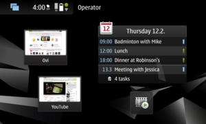
Desktop Widgets can be defined as miniature applications – or applets – that reside on the Desktop for convenient, fast access to useful information or controls. Maemo 5 contains up to four Desktops, as illustrated in Figure 1, totaling in 3200×424 pixels of screen real‐estate for Desktop Widgets.
| In Maemo terminology, in addition to Widgets, Maemo 5 also includes Application shortcuts, Web bookmarks, and Contacts. Technically, however, these are considered Desktop Widgets as well, and the same guidelines apply. Thus, for the sake of readability, the term “Widget” used in this document encompasses all the aforementioned applets. |
[edit] Widget design
[edit] Design philosophy
While Widgets can be understood as small applications, the design philosophy for developing a Widget differs greatly from that of an application. Most notably, Widgets are not supposed to replace applications in terms of their use and feature set, rather compliment them; consider the following guidelines as the fundamental design goals of building an appropriate Widget:
- Widgets must provide information or controls quickly and in an obvious manner; every feature and command should be immediately understandable, and accessible with a single tap.
- Widgets must provide only the most crucial features; they must be simple and efficient, designed to accomplish only a few tasks – but accomplish those extremely well.
- Widgets must be as compact in size as possible; even though Maemo 5 offers a generous amount of screen space, users must be able to place several widgets on each screen to minimize the need for excessive screen switching.
| Due to the high pixel density of the physical screen, tappable elements must be at least 70×70 pixels in size for convenient finger use. |
Due to the aforementioned design goals, not every application can be transformed into, or any data set presented with a legitimate Widget. Before starting development, consider whether the Widget provides any value for end‐users in comparison to existing applications or websites that can be one tap away via Application shortcuts or Web bookmarks.
[edit] Stock Widgets
Maemo 5 includes following Widgets, outlined in Table 1.
| Widget name | Description | Dimensions (in pixels) |
|---|---|---|
| Application shortcut | Provides one‐touch access to an application | 96×96 |
| Calendar widget | Displays the current date and upcoming calendar events | 352×252 |
| Google widget | Provides one-touch access to Google search | 176×146 |
| Location widget | Displays the current location of the user on a map | 316×368 |
| Media Player widget | Provides Media Player status and controls. | 338×148 |
| Ovi widget | Provides access to Ovi services | 490×88 |
| RSS widget | Displays the latest RSS feeds | 316×368 |
| Tutorial widget | Presents a tutorial on how to use the device | 800×72 |
| Web bookmark | Provides one‐touch access to a web bookmark | 176×146 |
[edit] Configuration options
Widgets that can be configured include a configuration‐button accessible in Edit mode. Tapping on the button reveals a dialog containing all the available configuration options. Figure 2 presents a fictional example of a configuration dialog.
[edit] Interaction
Within the Desktop, Widgets are interacted with by taps only (events should be initiated when the finger is released, not pressed down). Due to the prioritization of screen switching, Widgets do not support dragging or swiping gestures; this ensures that Desktop screens can be effortlessly panned even if they are filled with Widgets. Furthermore, long-tapping (tapping and holding the finger on the screen for an extended period of time) cannot be used for Widget interaction, since it activates the Edit mode by default.
N.B. Dragging gestures are naturally enabled in the Edit mode for repositioning Widgets, where screen switching is not supported.
In Maemo 5, Widgets do not support resizing. It is advised to not develop Widgets that dynamically change their size, because their visibility cannot be ensured; since Widgets can be placed near the edges of the screen, or near each other, any appearing elements can become occluded or entirely overlapped by other Widgets, or hidden outside the bounds of the screen.
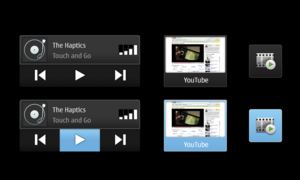
All tappable elements on Widgets must contain a graphical highlight (pressed‐down) state for providing visual feedback on the action. If the entire Widget is a tappable element, such as with Web bookmarks, the highlight state also encompasses the whole Widget. Examples of highlight states are shown in Figure 3.
While text entries and areas (also known as text input fields) are supported UI widgets, they should be used with care; if several text entries are needed, they can also be provided either via a custom dialog, or utilizing the Widget’s configuration dialog.
[edit] Visual look-and-feel
[edit] Size
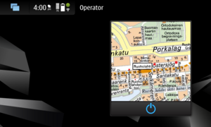
Widgets must be designed to be as compact in their size as possible, avoiding any excessive graphical elements that do not provide any meaningful information or controls. As a rule of thumb, the footprint of a Widget must never exceed half of the Desktop space allocated for Widgets, including a 24 pixel‐padding around the Widget (132,352 pixels total). The largest stock Widgets, Location and RSS, are close to the maximum footprint of Widgets, as seen in Figure 4; another, Tutorial, spans across the entire Desktop, but therefore remains limited in its height.
[edit] Margins and positioning
Layouts in Maemo 5 utilize a standardized set of margins. The recommended margins for Widgets are outlined in Table 2.
| Logical name | Size (pixels) | Additional information |
|---|---|---|
HILDON_MARGIN_HALF
| 4 | Marked as red bar in layout images |
HILDON_MARGIN_DEFAULT
| 8 | Marked as blue bar in layout images |
HILDON_MARGIN_DOUBLE
| 16 | Marked as cyan bar in layout images |
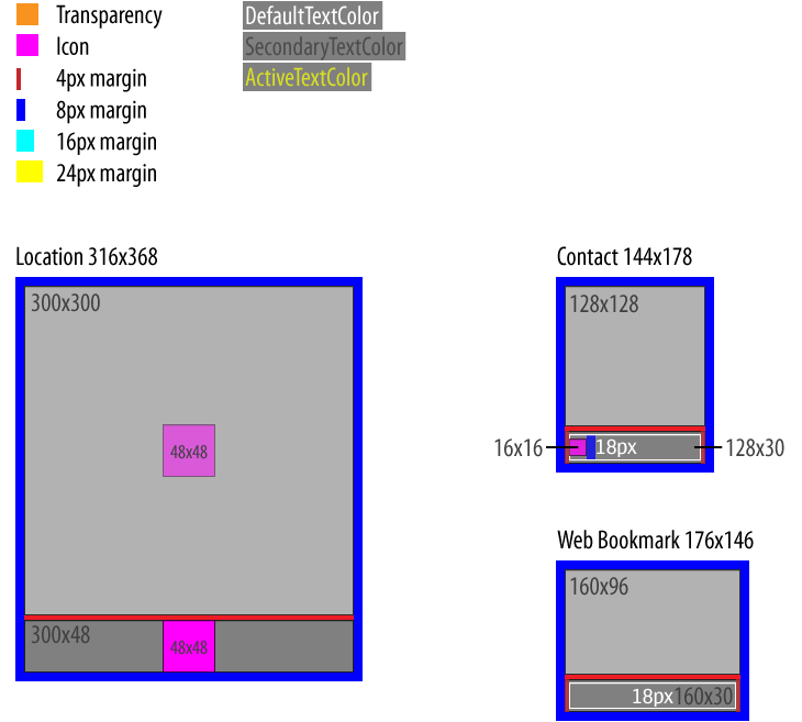
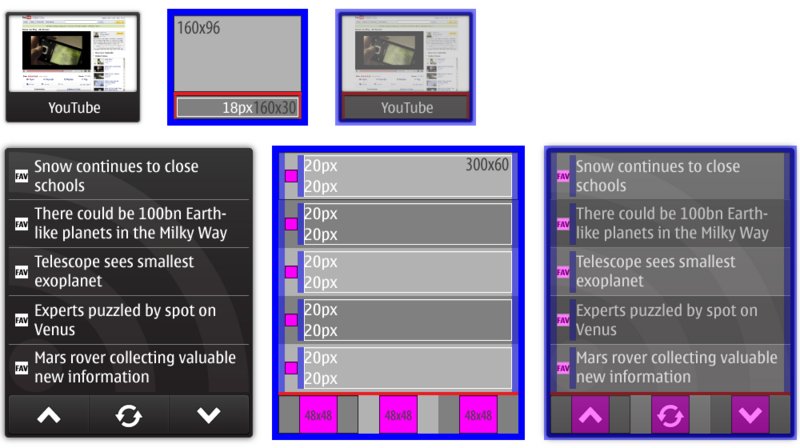
Stock widgets share common margins and positioning rules. Elements within Widgets are separated from each other by HILDON_MARGIN_HALF, and Widgets are surrounded by HILDON_MARGIN_DEFAULT; the surrounding area includes both the outer border of the Widget, as well as a drop shadow. Some examples are presented in Figure 5, and Figure 6.
The positioning of graphical elements such as text labels, buttons, icons and so on must be in line with the rest of the Maemo 5 guidelines.
[edit] Visuals
In Maemo 5, the overall graphical look‐and‐feel is designed as light‐colored text and icons on dark backgrounds. All of the default Widgets follow this principle; graphic themes also contain a so‐called reversed color palette, which enable the use of dark text on light backgrounds.
[edit] Typography
Due to their compact size, default Widgets generally use HomeSystemFont or SmallSystemFont as the font size, while DefaultTextColor is used as the default text color. There is also a standard Sans-Serif font available for use.
Text labels in Widgets should be separated with at least HILDON_MARGIN_HALF from the edges of their respective container elements to make sure that long labels do not end up touching element borders; see Figure 5 for visualizations.
Figure 7 presents an example of the use of typography in Widgets.
[edit] Development
[edit] Packaging
Main article: Packaging
Widgets are installed on the device using a normal Debian application package. As the package information of your desktop widget can be seen in Application manager (the application used to install Widgets), it is recommended to fill in the following information in the package:
- Application name – a descriptive name shown in the application package list view in Application manager
- Application short description – the first line (or 60 first characters) of the application description
- Application icon – a base64 encoded PNG image (sized 48×48 pixels). This icon is only shown in Application manager
Unless the installation script of the Widget package contains commands to place the Widget on the Desktop, users have to manually do so via Edit mode. Since this is an unnecessary step for the user, it is advised that the installation script handles the placement automatically. It is also possible to direct the Widget onto a specific Desktop view; however, the exact placement of the Widget cannot be specified in the script.
[edit] References
- This page was last modified on 1 February 2011, at 10:35.
- This page has been accessed 61,174 times.


